The master painters are an excellent source of inspiration and technique. One of the most important techniques we can learn from them is called Figure-Ground Relationship (a gestalt psychology principle). This is a technique that can help clearly define the subject by use of contrast. It’s also known for creating illusions, but for today we’ll just focus on some great examples containing a light figure on a dark background or a dark figure on a light background.
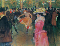
Let’s start with this fun painting by Toulouse Lautrec, where he’s at the Moulin Rouge watching a drunk couple dance like circus seals. To clearly define the subject, the woman dancing, he creates a light figure (her skin and gown) on a dark background (the men in dark suits). If the men behind her were wearing lighter toned suits, the dancing woman would be visually lost within the background.
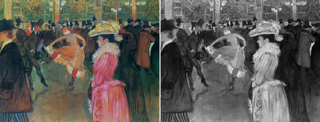
To make the tones easier to see I’ve converted them to black and white which will help determine the readability of the painting. The term readability is well known in the graphic design industry, but it can be used for any visual art. It’s all about visual communication…how easily your image (or design) is communicating to the viewer. Is it hard for them to read (lots of distractions, no hierarchy, misplaced elements of high contrast) or is it easy (continuity, unity, rhythm, figure-ground relationship).
Like a moth to a flame, we are drawn to areas of high contrast…that’s why converting an image to black and white can be used as a great tool for the artist. So, once we see Toulouse Lautrec’s painting in black and white we notice that the woman in red also pops out against the dark background. Now we can easily see the areas of high contrast used to grab the viewers attention…great readability…great figure-ground relationship. It’s safe to say that Lautrec wanted us to spend some time admiring these two women more than the other intoxicated characters within his masterpiece.
To get a proper understanding of the value and how it works with the figure-ground relationship, you can view Myron’s Introduction to Drawing Systems DVD and Palette Control and Color Theory. They go over in detail the value system, simultaneous contrast, and more.
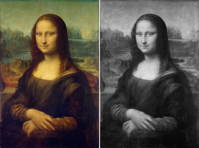
Now we’ll take a look at the painting of Mona Lisa by Leonardo da Vinci which is a great example of a dark figure on a light background. Her robe and hair are very dark which helps to clearly define her against the light background. Da Vinci uses aerial perspective to fade (reduce in contrast) the landscape in the distance because he knows this technique will add to the readability and viewing pleasure. If in his conception he created duck lips instead of this beautiful smile, he could’ve inspired even more cheesy Hollywood movies. Hindsight is 20/20 right?
We’ve seen great examples of Figure-Ground Relationship so far…a light figure on a dark background (Lautrec) and a dark figure on a light background (Da Vinci). Now let’s take a look at some more examples and see if you can spot the technique even easier.
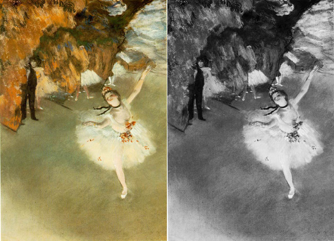
Here’s one by Edgar Degas where he has the ballerina as a light figure on a dark background.
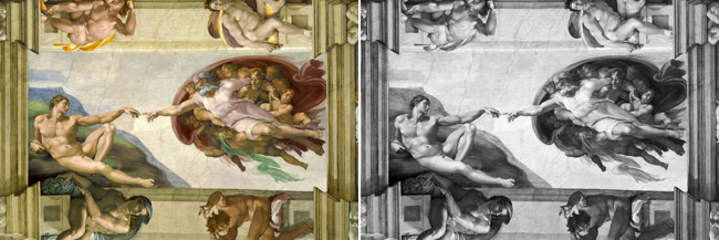
In this one we see Michelangelo creating a light figure (Adam) on a dark background. Even where Adam’s hair is dark, Michelangelo puts a lighter blue behind it (instead of a darker blue) to make the Figure-Ground Relationship even stronger.
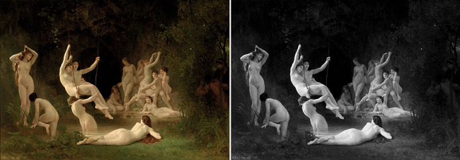
Here we see William-Adolphe Bouguereau using light figures on a dark background to clearly define each subject. The Satyr and man on the right are not supposed to stand out as much as the nymph’s (because they are being creepy) so he reduces the contrast and makes them dark figures on the dark background.
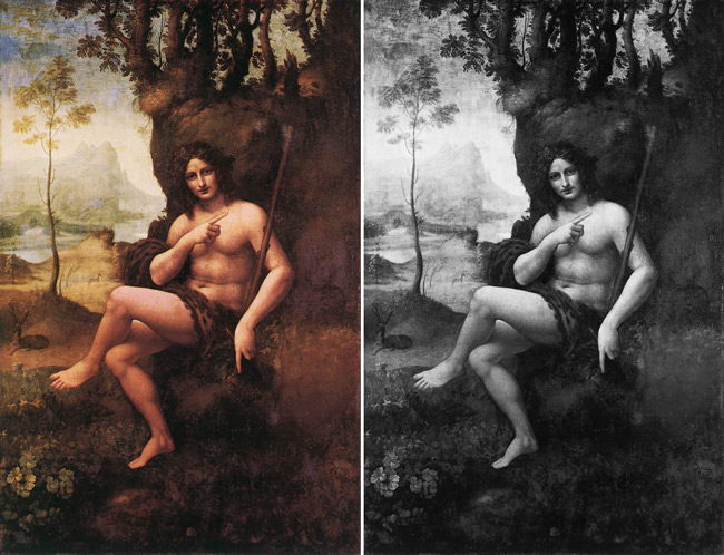
Of course, I couldn’t show you all of these examples without demonstrating what a “bad” Figure-Ground Relationship would be. This next painting by Da Vinci could be worse of course, but it will give you an idea of what works, and what doesn’t.
If you follow your eyes around the subject you’ll see that there is a substantial contrast where the skin meets the background…this helps separate the figure from the background (by the knee you can see how he adds shadow to create better separation). The problem is the lack of contrast when we get to the dark hair, the dark staff, and the dark leopard print boxer briefs (or whatever that cloth is). These dark elements of the painting are lost against the dark background. Our minds have to work harder to clearly define the subject and that’s a no-no when it comes to the viewing pleasure of any art. We’ll give Leo the benefit of the doubt and imagine that the original wasn’t as muddy as this replication.
I hope that helps you understand Figure-Ground Relationship and how powerful this technique is for communicating your visual message. (Remember, if you’re thirsty for more, Myron talks more about this subject in his invaluable Drawing DVD’s.)